Accessibility in eLearning Design
Web Accessibility is the tools, systems and processes you use to ensure all people can access content equally, without bias or impairment. Just as a ramp provides equal access to a building, so too does digital accessibility to your message.
How do we implement accessibility in elearning content?
We just hit a button, right? Well, not so much. Once you start to unravel the behemoth topic that is accessibility, you start to understand what a huge undertaking it can be. Fear not, in this blog we are going to walk you through what accessibility means, what the core principles are, why it matters and how to implement it successfully into your content.
Disabilities you may encounter include:
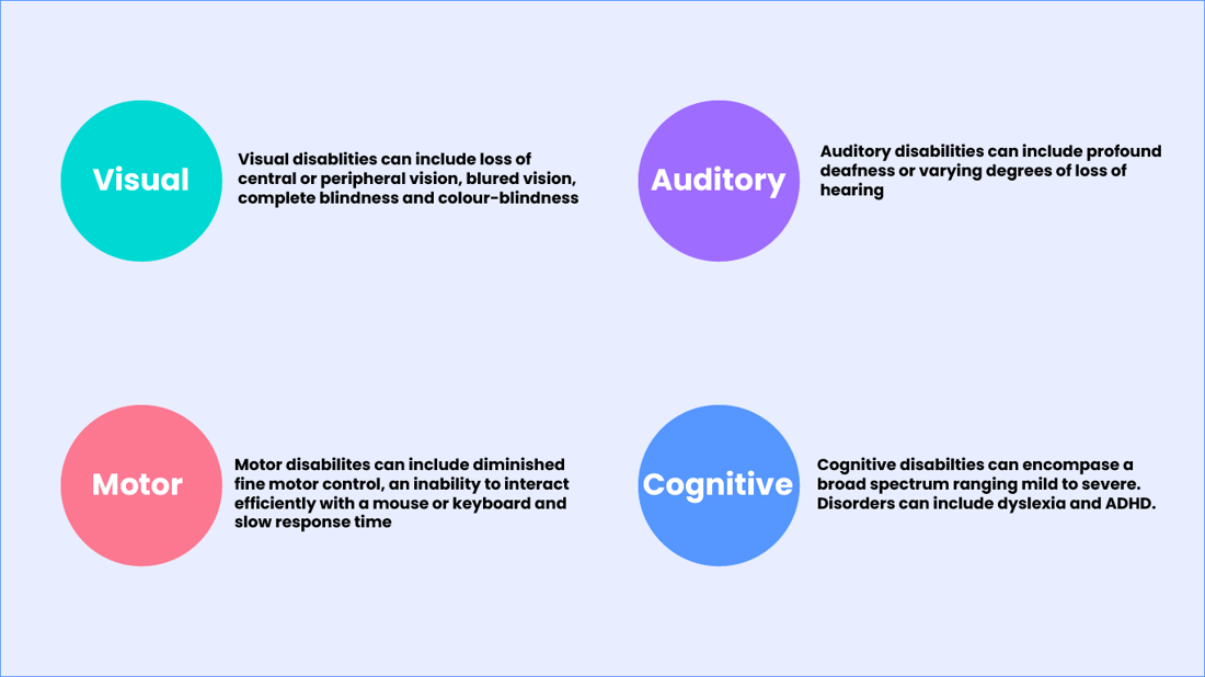
Visual
Visual disabilities can include loss of central or peripheral vision, blurred vision, complete blindness and colour-blindness.
Auditory
Auditory disabilities can include profound deafness or varying degrees of hearing loss.
Motor
Motor disabilities can include diminished fine-motor control, an ability to interact efficiently with a mouse or keyboard and slow response time.
Cognitive
Cognitive disabilities can encompass a broad spectrum ranging from mild to severe. Disorders can include dyslexia and ADHD.
What is WCAG?
Many moons ago when the internet was only just becoming mainstream, a group of advocates, programmers and researchers worked together with the goal of providing a single, shared standard of accessibility that meets the needs of individuals, organisations and governments internationally. The Web Content Accessibility Guidelines (WCAG) was the result of this. Currently we are on version 2.1, with WCAG 2.2 due to be published later in 2021. Within the WCAG standards there are three levels of compliance - A, AA, AAA with A being the lowest level of compliance to the guidelines and AAA being the maximum.
The core principles
Now, to go over the whole WCAG would take a long time so instead we are going to look at the POUR principles of WCAG:
Perceivable
"Information and user interface components must be presentable to users in ways they can perceive."
- This means having good contrast of colours, being able to see a hyperlink and generally being able to read the text on screen with ease or with the aid of assisted technologies.
Operable
"User interface components and navigation must be operable."
- There is a vast spectrum of disabilities, so if your user is unable to use a mouse then a keyboard alternative must be made available for them to interact with the content.
Understandable
"Information and the operation of user interface must be understandable."
- We all have different abilities and skill sets. Be aware of who your content is for and use language and an interface that your user can understand.
Robust
"Content must be robust enough that it can be interpreted reliably by a wide variety of user agents, including assistive technologies."
- This means that users must be able to consume the content with the aid of current screen readers as well as using proper style structures to closed-caption videos.
How does this affect your organisation?
If you are a government organisation based in New Zealand, it is vital you become familiar with these principles as you are required by law to meet at least WCAG 2.1 AA standards or NZ Accessibility Standards 1.1 (these are essentially the same thing).
Australia may not currently have official legislation requiring organisations to meet WCAG standards but it's worth noting by not making your learning accessible you may be in breach of the Disability Discrimination Act 1992. This aims to:
"eliminate, as far as possible, discrimination against persons on the ground of disability in the areas of [work and education], and to promote recognition and acceptance within the community of the principle that persons with disabilities have the same fundamental rights as the rest of the community."
If you are a private organisation, you will not be required to meet any accessibility standards - but this is not good a reason to avoid accessible practices and as stated above, you may be in breach of disability discrimination laws.
So why should you care about digital accessibility?
First and foremost, you should care because it is the ethical conclusion to make; it isn't enough to simply tick off the box of accessibility. In New Zealand alone 24% of people are considered disabled (source - stats.govt.nz) and at some point in our life we will all fall into that category. By not implementing accessibility with thoughtful intent, or even worse avoiding the topic altogether, you not only create unnecessary barriers for people within your organisation but you create an environment that doesn't allow for people to develop to the best of their abilities, which will have a knock-on effect for everyone else around them.
Let's explore this further by looking at how accessibility will impact Govt or Private enterprises:
| Government | Private |
| Legislative requirement in NZ | More services are going online/mobile |
| Must be able to service all members of the public equally | Most people will be considered disabled at some point in their life |
| Must be able to reach a wide selection of technologies and access points (old and new technologies, different levels of access i.e. fiber vs mobile, vs other) | Businesses are taking a vested interest in accessibility, making it a requirement not a feature for digital content |
| 24% of people are considered disabled in NZ (source - stats.govt.nz) | Most learning software is updating to include accessibility as part of their process. |
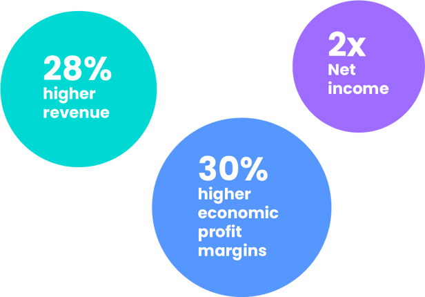 In terms of how this can impact a businesses' bottom line, a 2018 Accenture study showed that "Companies that have improved their inclusion of persons with disabilities over time were four times more likely than others to have total shareholder returns that outperform those of their peer group."
Out of the 140 companies that were included in the study 32% had "achieved – on average – 28% higher revenue, double the net income and 30% higher economic profit margins over the 4-year period [they] analyzed."
How to implement?
Now that we better understand what WCAG is, the principles it adheres to and how that affects your organisation, let's now look at how we begin to implement accessibility into our content.
1) First establish who your audience is and what level of accessibility they require by developing different accessibility personas. There is strength in numbers, so if your content caters for all abilities within your organisation, the benefits will be felt from the bottom to the top. This was examined in a study by Sage Journals which ultimately concluded that both non-disabled and disabled users benefited from increased accessibility online.
2) Take time to reach out to others about accessibility. It's not enough to just read about the topic; it is important to reach out to people whom accessibility impacts and get their input as well. The best tool in accessibility is the experience of those who live it and you may be surprised at how many people fall into the accessibility category.
3) Know your authoring tool! Take time to better understand the capabilities of your tool and whether or not it can provide you with the level of accessibility and customisation that you require.
4) Review the external content you may be using within your module. Accessibility goes beyond just eLearning. If an eLearning module includes external links or documents that aren't accessible, it will affect the experience as well. So, it needs to be planned out in advance, and you need to set the right expectations. You may also need to provide alternative forms of content to cater for people with a disability e.g. to explain visual content such as diagrams, charts, graphs, etc.
5) Include accessibility within your design and your approach. By doing this you engage more people, more consistently and create a better, more unified experience. Some great examples of this integration can be seen when looking at current website design trends. You will see that good design and accessibility go hand-in-hand. From clean, easy-to-read content on screens, to the standard use of website structure, to responsive design and the implementation of auto captions with video. Accessibility and the user experience are more hand-in-hand than ever and it could even be argued that accessibility is a foundation of good UX.
Accessible eLearning Module Download
Download our free Chameleon Creator accessible eLearning module example.
The module takes you through all of the various eLearning interactions so you can use as a guide and inspiration for designing your own accessible eLearning.
Check out these useful tools to assist in your accessibility implementation:
Hemingway App makes your writing bold and clear.
Colourblindly is an extension that helps developers create websites for people with color blindness.
Web Aim Contrast Checker - Make sure your content can be seen.
View a demo
In our 10 minute recorded demo, we'll show you how to build and publish your own module.
Share this
You May Also Like
These Related Stories
Empowering SMEs to create eLearning modules
5 ways to promote Te Reo Māori in the workplace


