Applying Learning Experience Design principles to elearning
If you work in Learning and Development, you can’t have failed to notice the big buzz on the scene is Learning Experience Design, or LXD as its mates call it. But what is learning experience design, does it matter, and how does it apply to elearning?
So, what the heck is LXD anyway?
Neils Floor describes himself as a pioneer in the field of LXD and defines LXD as “the process of creating learning experiences that enable the learner to achieve the desired learning outcome in a human centered and goal oriented way.”
He explains LXD as an approach combining design disciplines with learning disciplines.
Design disciplines
- Interaction design
- User experience design
- Experience design
- Graphic design
- Game design
Learning disciplines
- Instructional design
- Cognitive psychology
- Experiential learning
- Educational sciences
- Neuroscience
And he elaborates further on the five key points of LXD.
Experience. LXD is about creating powerful educational experiences that will last a lifetime.
Design. The LX design process typically includes research, experimentation, ideation, conceptualisation, prototyping, iteration, and testing.
Learning. The focus is on the learner and the process they go through. You have to understand why and how people learn. Experiential learning is part of the LXD foundation.
Human centered. Know and understand the people you design for, figure out what drives them and how you can ignite their intrinsic motivation.
Goal oriented. Choose the right goals. Select activities that enable the learner to reach goals. Align learning experience form, medium, and technology to the goals of the learner.
New kid on the block LXD vs industry stalwart Instructional Design
LXD has only been around since the late noughties, and it’s still very much considered a neophyte on the learning scene.
So, it may be illuminating to compare it to its more established counterpart, Instructional Design (ID), a learning approach originating in the mid twentieth century. Neils’ article on Learning Experience Design vs Instructional Design compares the two learning design approaches. He summarises his case by establishing a series of oppositions between the two disciplines.
Learning Experience Design
- Designing an experience
- Creative perspective
- Applied art
- Comes from the field of design
- Creative, experimental approach to design
- Creative mindset with design approach
- Elegant, refreshing, and surprising
- Uses design tools and software, web and gaming technology
Instructional Design
- Designing a course
- Scientific perspective
- Applied science
- Comes from the field of learning
- Methodical approach to design
- Analytical mindset with scientific approach
- Clear and structured
- Uses learning management systems, and e-learning authoring software
This take establishes the two approaches as very different. However, Neils is also candid that he has no background or training in ID. Therefore, his positioning of LXD in opposition to ID is based on observation, rather than an intimate knowledge of the more established discipline.
Same game, different name?
Instructional Design and e-learning designer Devlin Peck has a different take on the relation between LXD and ID. In his identically titled article, Learning Experience Design vs. Instructional Design, he compares the two disciplines based on methodology and concludes they’re identical in all but name. Both conduct learner analysis, design with clear goals in mind, recognise how people learn, and put scientific learning theory into practice.
Devlin sees LXD as a brand positioning play, rather than a distinct methodology.
He describes LXD as a natural backlash driven by designers “well-versed in the modern web” to the lamentable domination of the learning industry by death by PowerPoint.
And we’ve all been there haven’t we?
Rocked up to a day of training. Bit knackered because we’ve worked our arse off getting everything done, so we could take the day to learn. But we’re there and we’re looking forward to getting our teeth into some new skills.
Then the trainer gets into it, and our heart sinks as we realise we’re about to spend the next eight hours having 100s of verbose, badly designed PowerPoint slides read to us verbatim.
Devlin believes much corporate training and e-learning “devolved into glorified PowerPoints,” because “most instructional designers don’t conduct analysis, don’t pay a ton of heed to the science, and don’t push boundaries when it comes to the learning experiences they design.”
He cuts the perpetrators of PowerPoint atrocities some slack, saying: “Part of this may be because they fell into the role without getting trained as an ID, and an even bigger part may be the organizational pressure to churn out information-heavy training without regard for analysis.”
As graphic designers and web designers encroached on learning designers’ turf, they brought design thinking principles with them. The mediocrity of the learning design they found made them believe these principles were new to the industry, and they coined the term LXD as a statement “to differentiate themselves from their more traditional peers,” not realising design thinking was already at the heart of instructional design methodology, if not its practise.
Does any of this matter anyway?
Whether you side with Niels’ infectious optimism and believe LXD is a brave new dawn or tend towards Devlin’s more pragmatic take that there’s nothing new under the sun, it’s indisputable that the principles of LXD are a valuable tool to help us all up our learning design game.
Because magic happens when people become so immersed they forget they’re learning, and a practise that makes learning more fun and engaging will deliver better learning outcomes.
We’ve identified eight design hallmarks of good LXD:
- Offers a blended learning experience that suits different learning styles, giving people options to engage with lessons in different ways, on their own terms, and in their own time.
- Is story driven, using relatable real-life scenarios, fables, and metaphors.
- Uses the full design tool kit from video, animations and audio to graphics and graphs.
- Uses UX design principles to make the learning experience useful, easy, and enjoyable.
- Uses interactivity to engage people with content.
- Deploys gamification techniques such as quizzes, points, levels, and Easter eggs to engage people, evaluate their understanding, and reward progress.
- Includes opportunities to role-play learnings in risk free scenarios.
- Provides a reference resource where learners can refresh their knowledge.
Can e-Learning be improved by LXD?
Some learning designers question whether e-learning can embrace LXD principles because they perceive e-learning to offer too limited a palette to create blended learning experiences.
This may have been a valid critique when e-learning platforms were in their infancy, little more than PowerPoint on steroids. But now e-learning platforms like Chameleon Creator offer rich, multi-layered options to take learners on a journey, the learning experience you can create is limited only by your imagination.
Indeed, we firmly believe it’s a cop out not to embrace the principles of LXD to make the e-learning experience as rich and multidimensional as possible.
How do we apply the principles of LXD to designing e-learning?
The LXD design process is a typical user-centered Agile design process, with a focus on research, experimentation, testing, and iteration to improve your learning product.
If we were to formalise the stages of LXD design it could look something like this.
Understand learners’ needs:
Curate information to create activities that meet your learning objectives.
Ideate using best practice learning principles guided by science:
It can also be useful to consider the phases of an optimal learning experience.
Tips and tricks for making e-learning a more immersive experience, from a Chameleon power user
We sat down with designer and e-learning developer Annette Khaw from etrainu, an e-learning development consultancy based in Australia and Atlanta, USA. Etrainu specialise in creating courses that deliver high learning retention for their customers and use Chameleon as a platform to deliver their interactive and engaging e-learning.
We’re big fans of Annette’s work. She makes some the best e-learning we’ve seen, so we’re tickled to share her thoughts on how to make e-learning a more delightful experience.
Annette uses the Action Mapping process developed by Cathy Moore. This streamlined process helps her map out training needs and explore how training will be delivered. Note how this aligns closely to the first four steps of the LXD design process described earlier.
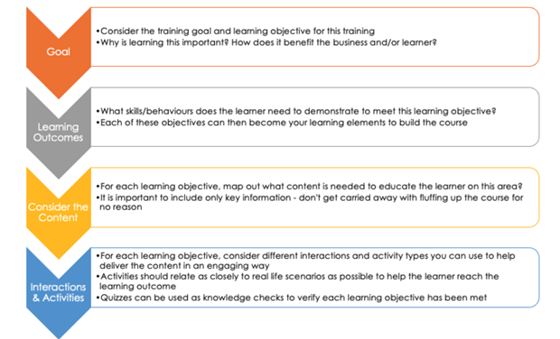
Five LXD e-learning principles
Annette also uses five key design principles to make her e-learning engaging and sticky.
Use your learners’ own words and experiences. Make sure the language, voice and real life scenarios you use are familiar to your learners.Mix it up. Different people absorb information in different ways. Use a variety of techniques to convey information. Mixing up video snippets, voice overlay, infographics, images and text ensures you’re catering to different learners and keeping it fresh and interesting.
Keep it tight. Snackable learning is tasty learning. Break your lessons up into bite sized chunks, and don’t exceed 25 minutes as this is the max info people can absorb effectively. And don’t put too much text in your learning materials either. A tight game’s a good game.
Stay on task. It’s tempting to teach people all the things. But stick to things people need to achieve their learning objective. And keep your learners on task by telling ‘em what they’re going to learn at the beginning of a module and recapping what they’ve learned at the end.
Test and refine. Once you’ve created your first cut, give your e-learning a whirl with a group of learners to get their feedback on how you can make it better.
LXD principles in action in Annette’s work
Annette has allowed us to share some examples from her work, where she’s used Chameleon Creator’s array of interactions to create a rich, blended elearning experience.
What a good meeting looks like
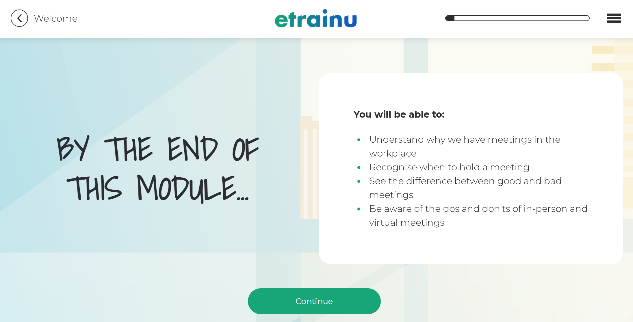
Many meetings are unnecessary. In fact, while we’re dealing in harsh truths, a lot of meetings could be an email. Which is why Annette’s guide to good meetings is a jolly fine thing. View the full module here, and check out the key elements we will explore below:
1. Here she outlines what we’re going to learn. Note how she keeps it short and sweet.
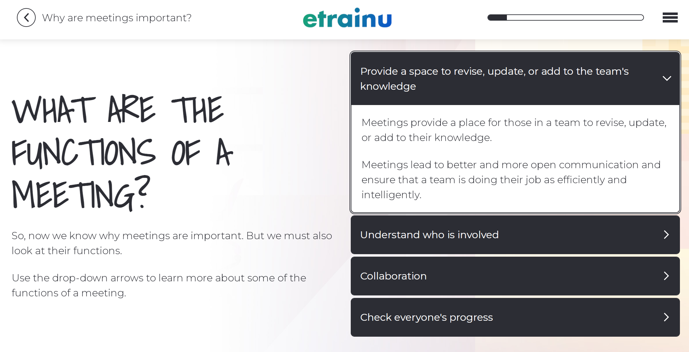
2. Here Annette uses the accordion function to explore why you might want to hold a meeting. Using Chameleon, you can make interactions compulsory, so here a learner has to explore all four meeting functions before they can continue to the next section.
Check out her clear instructions throughout so that people know how to use the interactive functionality.
3. Some cheeky pop-up functionality to help you work out when to set a meeting. Clicking on a card brings up a pop-up window with more info.

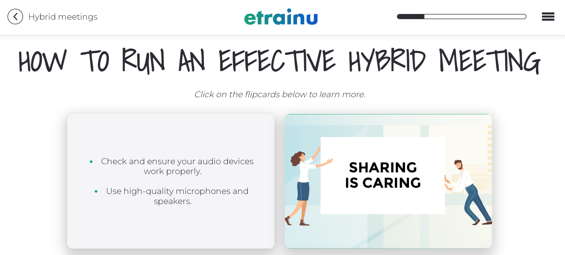
4. Here’s a nice use of flip cards teaching people how to run a good hybrid meeting (that’s a meeting where you’ve people both in the room and online in case you were wondering).
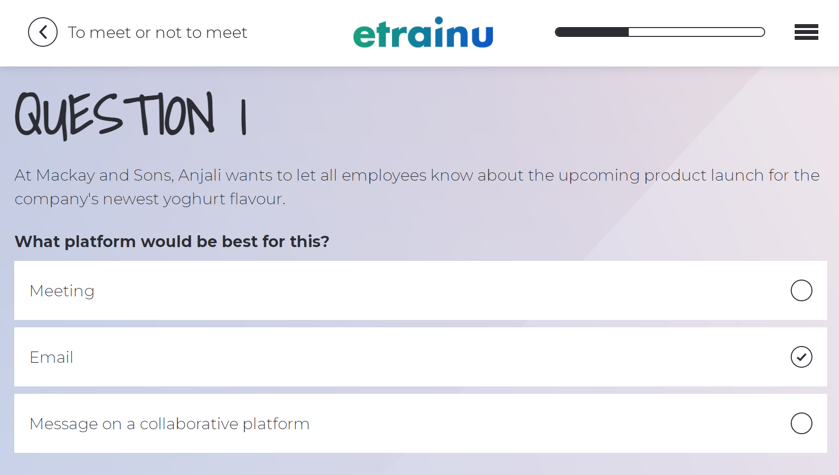
5. Now we come to consolidating learning with questions. When I get a question wrong, I get a friendly pop up message that asks me to give it another go. Getting learners to retry answering questions is an effective way to get new knowledge to stick.
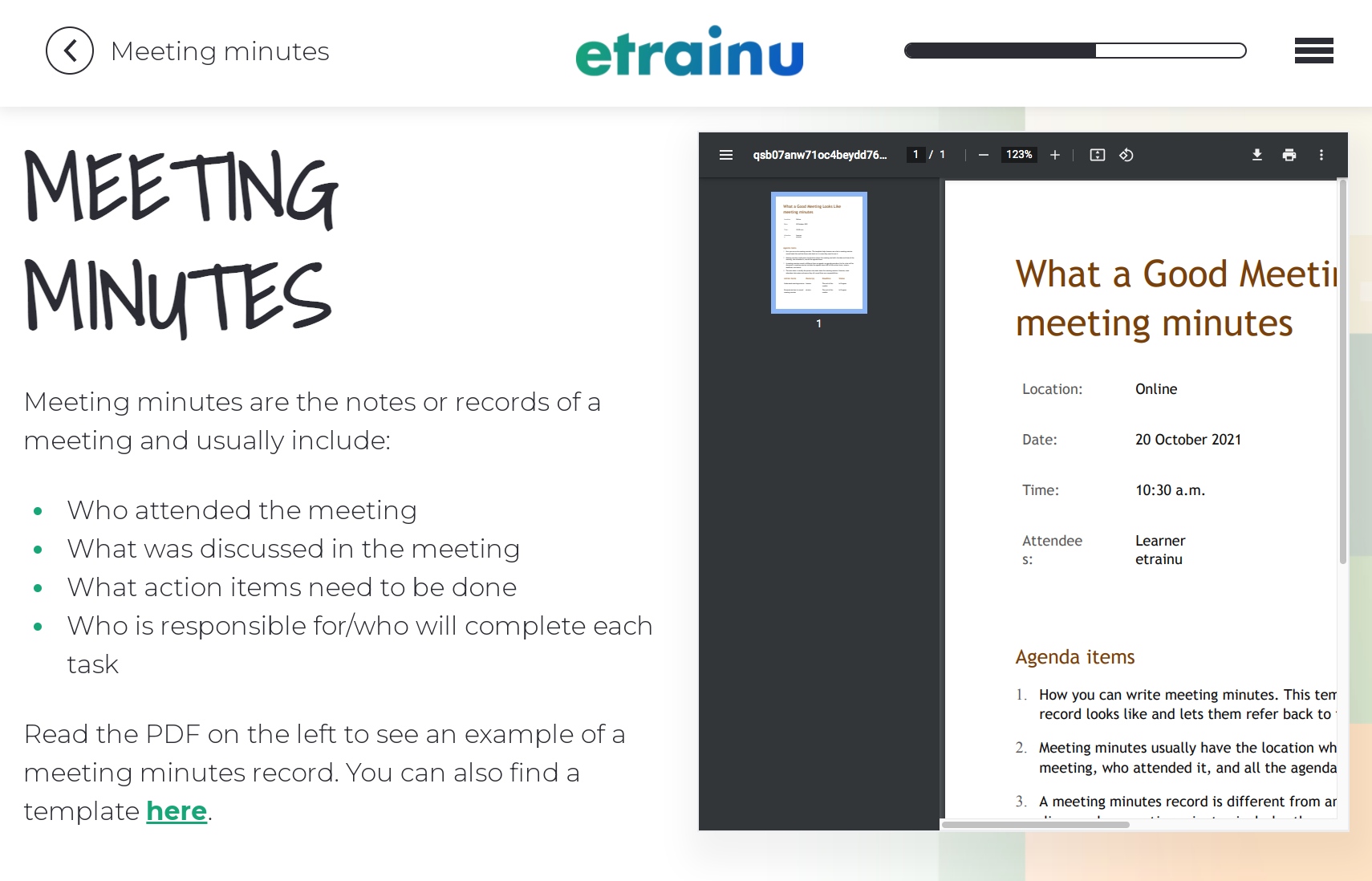
6. Ooooh look. A handy tool people can download and use.
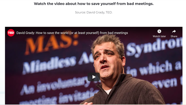
7. A hilarious Ted Talk about saving the world from bad meetings. See how Annette includes diverse types of content to keep different kinds of learners engaged.
It’s also important to consider content from an accessibility perspective. Chameleon’s video snippet and voice overlay functionality makes content more accessible for people who are visually impaired.
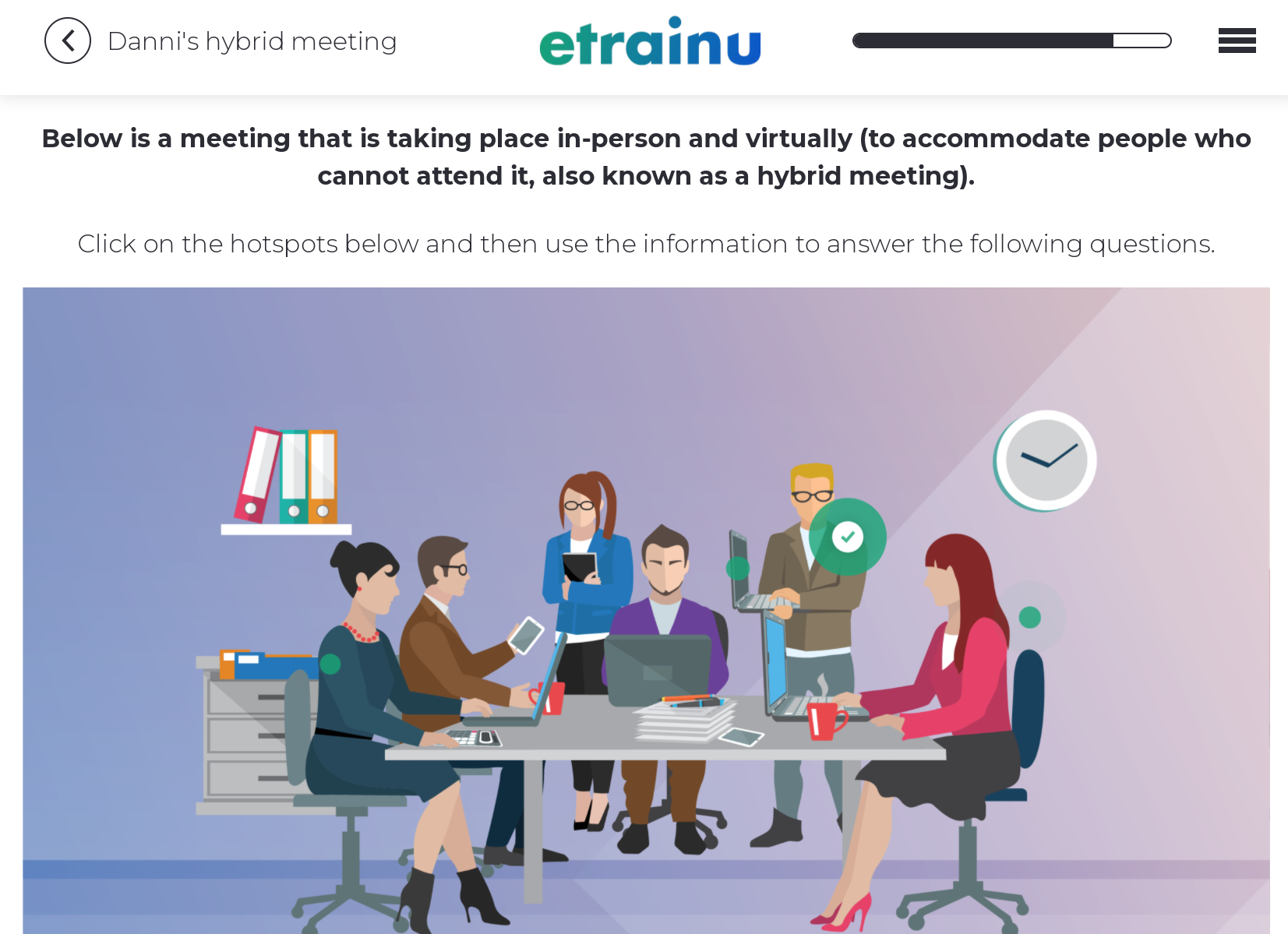
8. Finally, here Annette has used Chameleon’s hotspot functionality to explore a hybrid meeting scenario visually. Clicking on the little green hotspots walks the learner through a story rich in the office dysfunction we all know and love.
Scenarios are excellent content for e-learning as they familiarise learners with new ideas in a more engaging, relatable way than dry information.
You can test what people have learned in a risk-free environment by asking them to make real life choices in a true-to-life scenario. This is where e-learning is wonderful, because some real life scenarios are far too dangerous to recreate for learning purposes. Case in point, Annette designed learning for lifeguards that explores how to handle a shark attack using a true-to-life scenario.
Make your e-learning richer, stickier and more delicious
If you keep coming back to the three keystones of good learning design:
- Focusing on your learners.
- Solving their problems and delivering their goals.
- Following best practice learning principles guided by science.
You’ll create useful, effective content.
But we believe the intent of LXD is to exceed this, by also delivering the X factor of fun and delight. This elevates learning from chore to a pleasure, from dry instruction to rich experience.
That’s why we’ve invested time, energy and imagination in making Chameleon Creator a tool that offers learning designers a full toolkit of interactions that empowers you to mix it up for all learning styles. Bon appetit friends.
What to read next:
View a demo of Chameleon Creator
In our 10-minute recorded demo, we'll show you how to build and publish your own module.

Written by: Rhys Kerr | CUSTOMER LEAD
M +64 27 260 5764
Share this
You May Also Like
These Related Stories

Storytelling in Learning Design

Measuring the impact of learning
